Connectivity in the 21st century
Most of your users have dodgy connectivity. How can you design around that?
I'm currently writing this article in the middle of the Caribbean, from my stateroom on a cruise with the family. The fact that I have pretty reliable connectivity is astounding, and it speaks to satellite internet that I can effectively manage systems under my control from even miles offshore. (I know what you're thinking: "Mark, this is the time to disconnect!" and believe me, I have)
Over the past week, I was able to experience various degrees of connectivity, from (what we would call) a solid 4g connection in a Miami-area hotel, all the way to zero service in the middle of the Yucatan jungle, where people congregate at satellite internet stations for a brief amount of localized wifi signal. On the ship, it's extremely high-latency but decent throughput, so sites that shard domains wind up getting hurt versus sites that effectively pipeline assets over one HTTP/2 connection.
Putting myself in this mixed-quality environment and browsing or getting some work done helped me experience some of the lessons that I've learned over the years around managing user experience given their connectivity.
Time to first paint is incredibly important.
My number one gripe for the time when I was on the cruise ship, and the time that I was fumbling for cell service in the middle of the Yucatan peninsula, was that I didn't know if my request had even been initiated, if the server was just slow, or did I just have a temporary lull in service. Operating systems, whether MacOS or iOS or Android or Windows or whoever, all do a pretty lousy job at informing the user when they're in a low-bandwidth environment and what the network request is doing.
We've all read the anecdote about Amazon speeding up responsiveness by a tenth of a second earning them millions more in revenue, and it's a great anecdote, but it underlies the problem that you're trying to overcome - users are impatient and have other things to do than wait for your site to load. It takes half a second for someone to just tap their back button or swipe the tab away and you're competing against that attention span.

If your application can respond quickly on the first page request, with an extremely fast paint, that will give your users much more confidence that they can spend their time waiting for your site to load. That quick initial visual feedback goes a very long way in giving users the perception of speed. What I like to do is have some embedded CSS that sets the body background color to one of the primary site colors, just to show the user that yes, something is happening. Then, I can have a container div with the correct background color set via external CSS.
My first paint can be as soon as the initial HTML starts loading, and then I can start layering on more visual cues and feedback while the rest of the page is loaded and the external assets start transferring.
Your users are primarily on mobile devices.
As little as five years ago, that statement would have been crazy to make. Today, a large majority of your users will see your site from their phone. App and site discovery these days is very social; people will copy and paste links in text messages, or your users will see links in emails that they read on their phone, or they'll tap on links from social media to get to your application.
The number of users hitting your site via a mobile device is only going to go up, and it was surprising to me how rapid mobile growth was when I was at Skechers. We saw revenue placed via mobile browsers completely take off, and this was before we had done any changes to the site to accomodate them. People were zooming in on desktop pages and placing orders on their phones even though the experience clearly wasn't tailored for them. As soon as I saw this happening, we put every other epic on hold in order to start making a responsive layout.

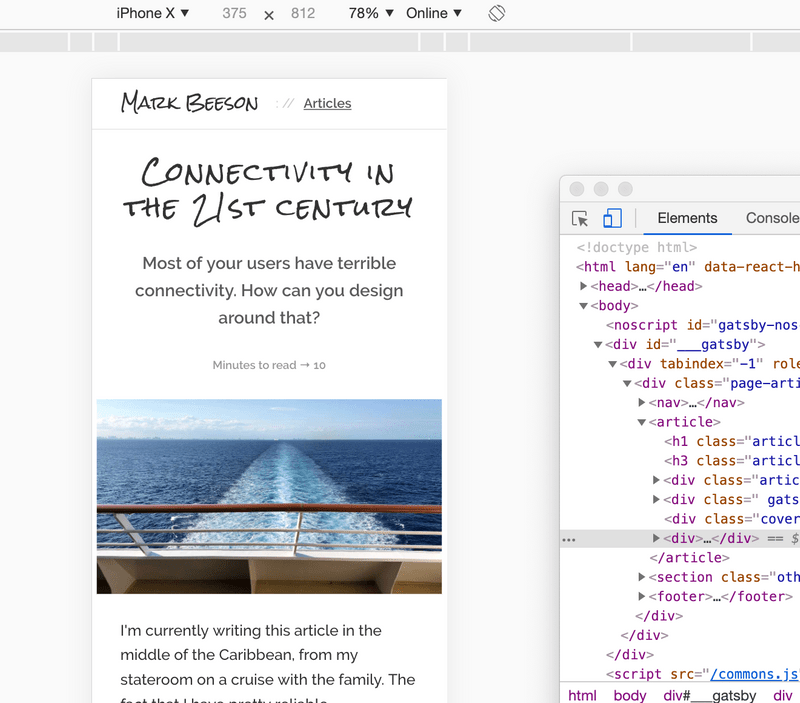
Today, you will be tempted to design screens using Sketch or Illustrator or whatever and mock out your desktop experience first. Skip that and design for a phone first. The limitation of about 400 pixels wide by 800 pixels high is what the reality is for most of your users. Get that design right, then design for desktop users. It has been my experience that creating a mobile design and then adapting it to desktop ("hey, let's use the extra real estate to reveal the cart contents!") is far, far easier than taking a desktop design and figuring out what you need to cut ("uh, I think this column should wrap below the other, and then put this piece into a hamburger menu, and then, uh...").
Complicated desktop interactions will have limited payoffs.
Due to the sudden growth of mobile users, a lot of very traditional desktop paradigms quickly evaporated. Remember dropdown menus that only show on hover? Those still exist in some places but have become such a huge drain on engineering resources that it no longer makes sense to include that kind of functionality when you're creating a roadmap for your MVP. And why would you? You're making functionality that has a dubious value - only showing information when someone performs a nonintuitive action - and that functionality is limited to a subset of your users.
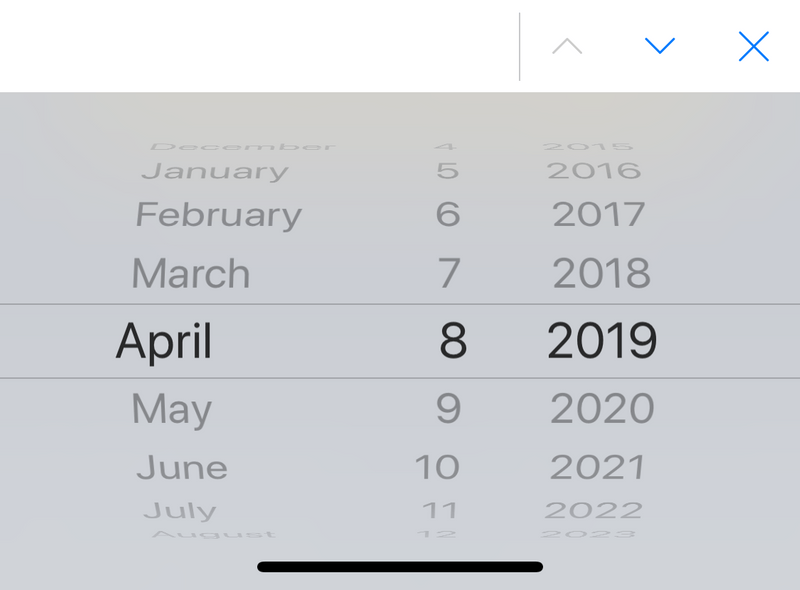
Even functionality that you would consider no-brainers need to be evaluated when creating applications for your mobile users first. Have you navigated a native select element on iOS? It is such a ridiculous dialog on the iPhone yet people continue to throw styled select elements into their designs. They're unwilling to display a list of choices or have too many choices to display neatly on a page, but a select element compounds this frustration on mobile because of how kludgy the native select dialogs behave on iOS and Android.

Ditch the sliders. Ditch the hover effects. Ditch the color wheels. Ditch the date pickers. If you can limit your input to text, links, and buttons, your mobile users will be able to interact quickly and easily. Go into your design sessions with the understanding that serving your mobile users the best user experience they can get, and then expand upon that experience if time permits, and you'll still be able to create some great functionality and great design.
Layer on interactivity as users browse.
You've heard this one in discovery - "what's 5k more for this functionality?" - then it turns out that your overall engagement starts dropping even though you're offering users more features. One of the most important things you can do is to make sure that your modules are only loaded when needed and not one moment earlier. It turns out that you don't need to include a bundle of 10k worth of Javascript for sharing a photo when you haven't shown the photo yet.
Load only as much as necessary to display your initial page, and then either in the background or as part of user interactions, then load any additional code. Angular and React both make it easy to code-split, and vanilla Javascript can do this as well. (I tend to inject script tags into the DOM on demand) Code-splitting, combined with some sort of visual feedback that yes, something is loading, will make your initial user experience feel extremely fast. This is what gets people to come back to your application over and over again.
It's important to plan out how your users are going to load your application. What are your users expecting to see when they load the page, what are you expecting them to interact with, and what other functionality should exist on the page. I break page functionality into four buckets and load them in turn, so they don't block the rest of the site.
- First, what scripts do I need to display the initial content of the page?
- What scripts do I need to display anything else I wnat the user to see?
- Once the page has been built and is showing, what scripts do I need to get the user to interact with the page?
- Last, what ancillary functionality do I need to load that may be necessary for interaction but isn't a primary action?
In a low-bandwidth environment, omitting buckets 3-4 will still allow the user to see the content that I want them to see, and if they're kind enough to wait around, I'll offer more functionality when they start tapping around.
Always show progress from interactions.
If your users are clicking a regular link to go from page to page, let the browser do its thing. It will show the user the progress of the DNS query, initial request, response, and subsequent loading of the page, all of which users have been very conditioned to read.
However, if you're doing some custom interaction (eg a button press to send an XHR for a form submission) you should always display some progress or some acknowledgement that the user's action did indeed go through. One of the eye-opening behaviors I saw in my low-bandwidth environment was that XHR requests that you would expect to be done in less than a second, would go for 10-15 seconds with no visual feedback, and I was tempted more than once to tap on the submit button again.
Some simple graphical treatment to your button is a good start; "this request has started but hasn't finished" should be a CSS class that you could apply to lots of elements, then do a broad stroke of removing that class when any XHR request has completed.
Additionally, when a request has completed, put up what material design calls a "toast", a little line of text that shows an acknowledgement of success, and disappears after a few seconds. This gives your bandwidth-constrained user more feedback to show them that it's okay for them to continue using your product.
Your bandwidth waterfall graphs only tell one story.
At Skechers, we spent a large amount of engineering time on getting the blue line in Chrome inspector to keep moving to the left; getting that first paint optimized was extremely important to us.
The third-party marketing pixels that we added would always kill the page load time, but we would add them well after any functionality had been loaded. We had our network inspector bandwidth waterfall graphs optimized about as well as we could. We would shard requests for images so browsers could download more of the page faster, we were using static assets whenever possible, cached on the edge for users to download quickly, and we spent a good amount of time even shifting CSS into page-level bundles to keep rendering from being blocked as much as possible.
Then out of the blue, customer service started getting calls that people were unable to browse the site, or they'd get strange styling, or broken functionality. Our external monitoring service started sending alarms up. We were having essentially a massive outage, and - of course - we couldn't replicate the problem internally. Browsing from external networks rapidly showed the problem: our DNS provider was being DDOS'ed and was only able to serve a percentage of queries. All of our static asset shard hostnames were hurting us. We wound up having to switch DNS providers on the fly, and existing browsers were effectively hosed until the TTL on the domains expired.
The moral of this story is that you need to effectively test your application in multiple environments, and make sure that all of the pieces of your stack are taken care of. The web is a pretty brittle environment, and trying to browse when DNS queries take 5-10 seconds to complete can be maddening. When you're creating your application, make sure to spend just as much time on every piece of your stack that talks to clients, not just the HTTP layer.
Native apps versus web apps in the jungle.
Let's not leave out the native app developers! It's just as important, if not more important, for native apps to provide the same kind of base feedback as a browser. I tried using a few native apps in an extremely bandwidth constrained environment (just outside the ruins of Chacchoben) and the distinct lack of feedback from most native apps is both surprising and disheartening.
In almost all cases, native apps would throw up a modal dialog complaining of no internet access, and then do nothing. Some apps would have limited functionality and then would stall out, showing no feedback that something was happening. I wound up manually closing apps more in the past week than I had in the past six months, and I'm convinced that I lost data.
Native apps need to know how to perform in bandwidth-limited areas. Cache network requests for later if necessary. Perform actions when the network is available, but don't put up gigantic screens that stop users from performing any interactions with your app.

Last, native app developers, you need to provide an experience that is significantly distinguished from a web app, otherwise I would recommend just creating the web app. Users in bandwidth-limited locations just aren't going to download 50MB for something that they can do on the web. You need to sell them on the prospect of doing more than just a stylized version of a browser. Whether that's location, accelerometer, biometrics, gestures, or what have you, those features and functionality need to be called out up front.
What I've learned from designing for National Geographic.
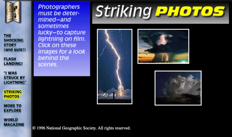
In 1996, I created a microsite for National Geographic called Lightning, the Shocking Story. The biggest challenge we had was that National Geographic put a constraint on us for overall page size - the entire page had to be less than 50k to download. With animated gifs, we had an extremely hard time staying under that limit, but we managed to pull it off with an extreme amount of optimization.

The great thing is that the page still renders (mostly), the images still work, the Quicktime movies still play. You could browse this page from an island off the coast of Belize and enjoy it. In contrast, the web font that the Wayback Machine uses for the header of the page is 28k, more than half of our budget per page.
Obviously we don't need to go to such extremes when thinking about creating pages for our audience, but the advent of mobile technology has given internet access to such a huge swath of people, and has also changed the primary browsing patterns of people in general. It's important to design for people who are both in an extremely bandwidth limited environment, or just people going through a temporary lull in cell service. What's the first story that you're going to add to your backlog to serve these scenarios?